Two 7 Five Office Building Renovation
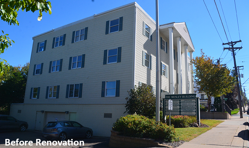
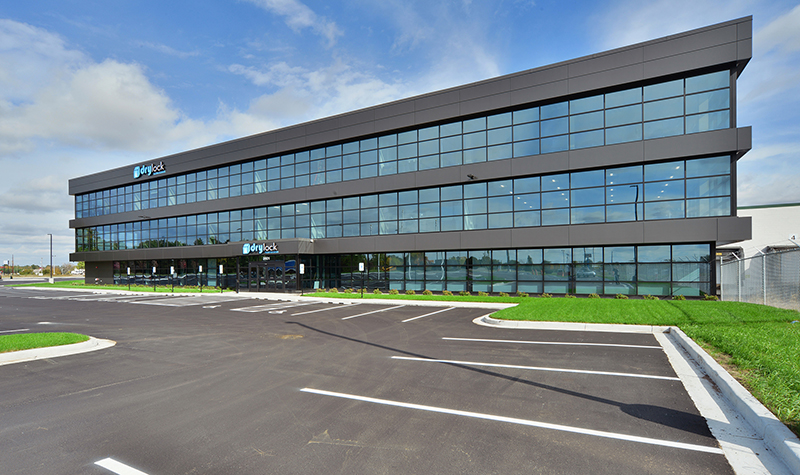
« Return to Project SearchAyres’ architects and interior designers creatively transformed this dated 1980s colonial-style office building into a new, sleek, modern venue to help the owners improve the building’s marketability. The 15,754-square-foot, three-story office building with underground parking is in Stillwater, Minnesota.
Bold exterior updates
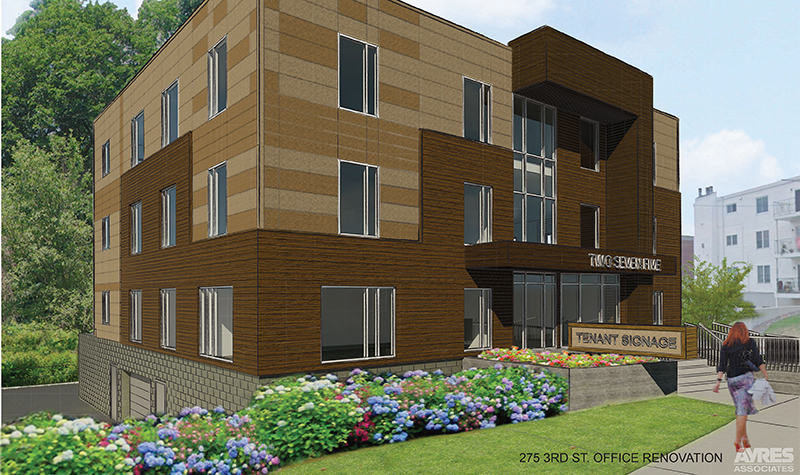
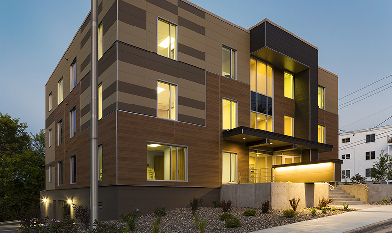
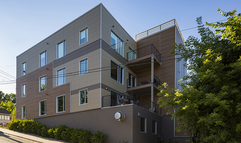
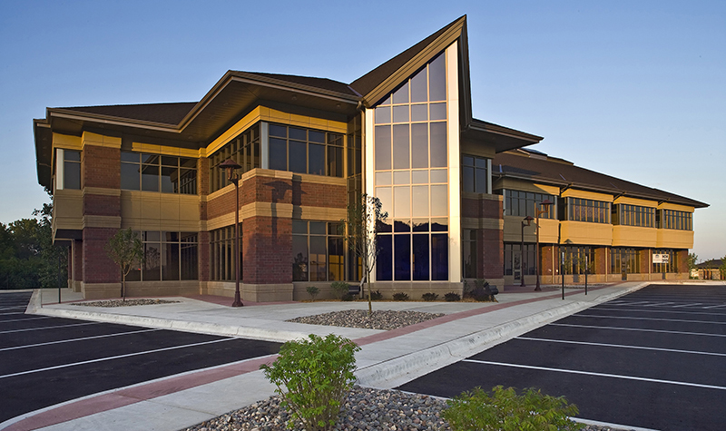
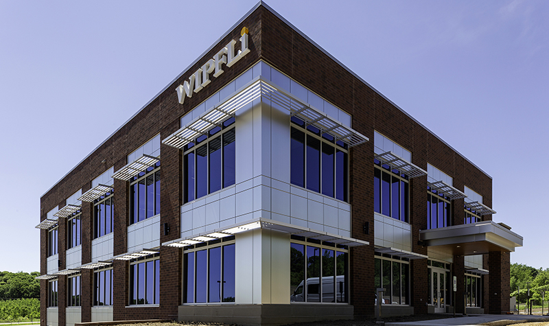
The owner has attracted quality tenants to the building, thanks to the curb appeal delivered by the project’s dramatically updated, modern design and a much sharper appearance, in part because of updated signage, exterior lighting, and built-in planters that have replaced overgrown plantings.
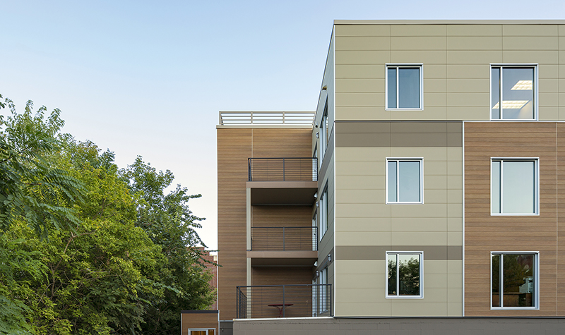
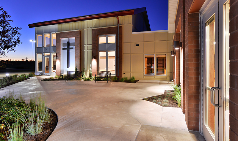
The project involved replacing the existing vinyl siding and small wood windows with new cement board siding and larger aluminum windows, giving the building a more modern style and letting in much more light for office tenants.
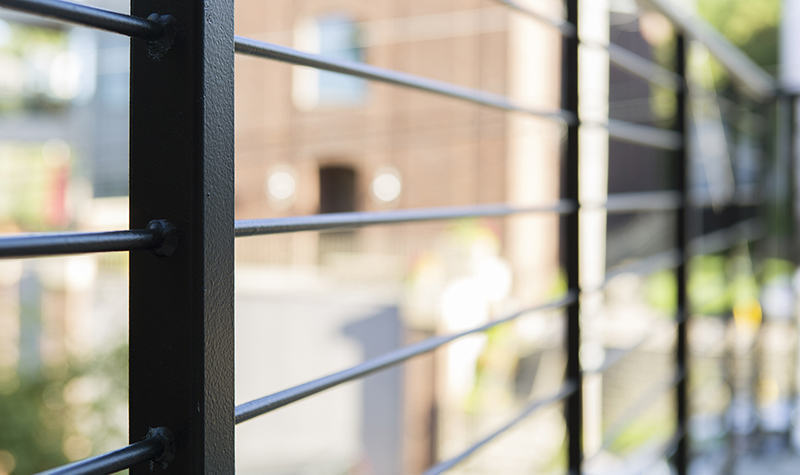
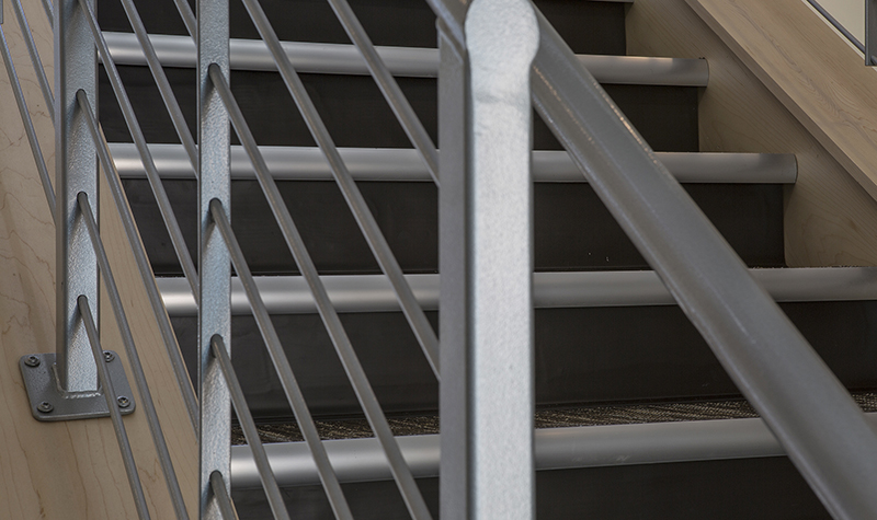
Our design team eliminated the existing front canopy/gable roof, extended the parapets upward, and added a new flat roof. A new front canopy was added, creating a more modern look. The rooftop equipment was relocated to the middle of the roof along with louvered walls to screen the equipment from view. The project replaced the dilapidated decks on the second and third floors with new composite decking and metal rod railings. The decks take full advantage of the building’s beautiful view of the St. Croix River.
Our team worked with the City of Stillwater’s Heritage Preservation Commission to gain approval for the project’s design and chosen exterior materials. While high-maintenance wood siding had been considered for the building, our team found a more practical faux wood alternative that was acceptable in terms of its historical look while providing much better durability with low maintenance.
Brighter, more navigable interior
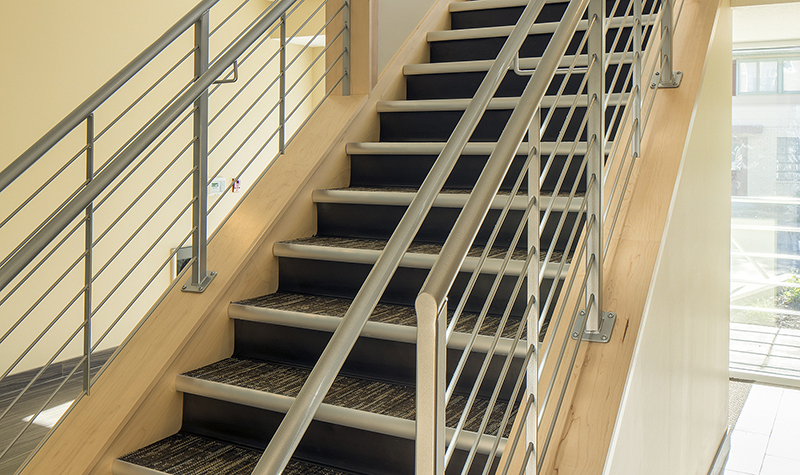
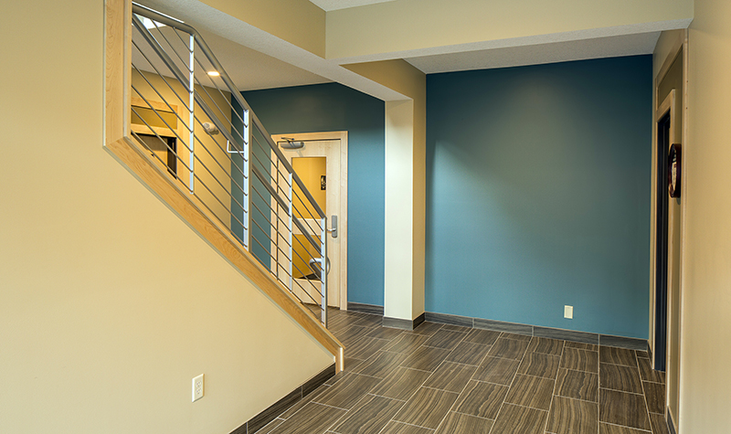
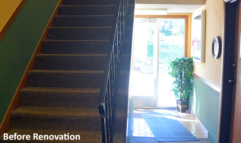
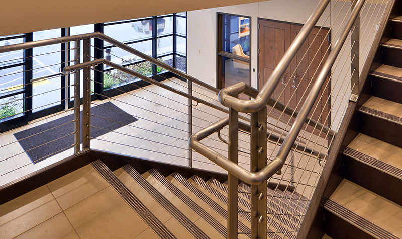
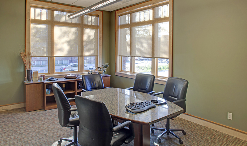
We removed existing walls to turn a dark, cramped, unpleasant entry into a more open, inviting, bright space with more effective signage pointing the way to tenant spaces. Navigating through the building is easier for visitors, in part because of the brighter corridors and colorful trim calling attention to the entrances to each tenant’s space. Ceilings were raised in the corridors, where flooring was replaced to silence annoying squeaks. Half-glass tenant doors provide a more inviting appearance and allow in light from the corridors. Carpeting was replaced with tile in the entry area to cut down on maintenance and provide a more updated look. Window replacement increased energy efficiency and greatly cut down on draftiness in the building’s offices.
Streamlining of heating/ventilation/air conditioning (HVAC) and electrical systems opened up space to improve the restrooms, which were updated and made Americans with Disabilities Act (ADA) accessible.
The building’s ADA-compliant entrance was switched from the front of the building to the back to provide people a shorter, more level route from their car to the building’s elevator.
Responding to project challenges
Challenges included value-engineering the interior finishes after unforeseen foundation, wall, and roof deterioration chewed up part of the client’s budget once demolition/construction got underway. The intended look and durability of interior finishes was maintained despite opting for more economical sources. Our team also remained flexible with providing design alterations in deference to fire codes.
Constructing the project around the building’s daily operations also presented challenges. Renovations were designed in a way that construction could be staged to minimize disruption for existing tenants.
Project Information
Client's NameGrady Erickson
LocationStillwater, MN
Primary ServiceArchitecture
MarketDevelopment + Commercial



.jpg)
.jpg)
.jpg)
.jpg)
