Visual Communication: Enhancing the Message and Inspiring Collaboration
It’s been said that drawing is a designer’s first language, communicating ideas in 2D that will eventually be constructed in the real world. The graphics vary in detail, complexity, and refinement, and for good reason. Similar to for-construction drawings, which have established milestone deliverables of schematic design, design development, and construction documents, each progressing the design and level of detailed information, graphic renderings should also convey varying levels of information through the phases of design.

About the Expert:
Craig Stoffel has well over a decade of experience in a broad range of projects, including downtown master planning, complete streets, green infrastructure, EPA brownfield and area-wide urban revitalization planning, community parks, regional trails and educational campus design.
How Much Information Should a Graphic Communicate?
It’s important that the graphics communicate the right amount of information, or more accurately, no more than what’s been identified and developed by the design team. Graphics, mirroring the design process, are intended to communicate the stage of design, focusing the message, and matching the level of resolved detail.
Before jumping into producing a graphic, it’s essential to understand several key questions:
- Who is the audience?
- How is the graphic going to be used?
- What is the message you’re trying to communicate?
In other words, what is the goal or takeaway we want the viewers to receive and react to?
It’s not always best to bring photo-realistic, 3D renderings to a public workshop to ask community members what they want in their space. Polished renderings convey the design is finalized, down to the color of the brick paver, even if your team is still working through the layout and circulation of the walkway itself. The message received is the design is done, so why did they bother to come and provide input?
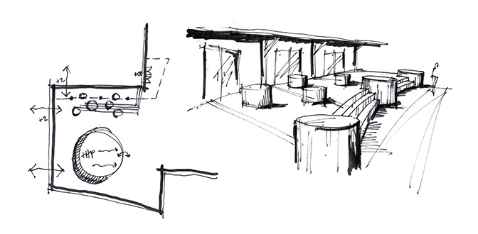
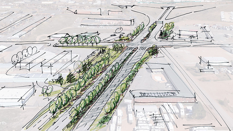
For early conceptual design, I’d argue (and do) that a hand-rendered plan and perspective sketch are better at communicating the essence or feeling of a design. The audience immediately understands the design isn’t fully resolved, rather it’s the exciting time of creating, exploring ideas to get the idea somewhat resolved (more on Design Charrettes in another blog!). These loose concepts create a collaborative exchange of ideas. The lack of detail allows the viewer to use their imagination to visualize the space, fill in the gaps, and pose questions that create new ideas which might have otherwise been missed. Great design happens when there is a deliberate space for such iterative design discussions, analysis, and evaluation.
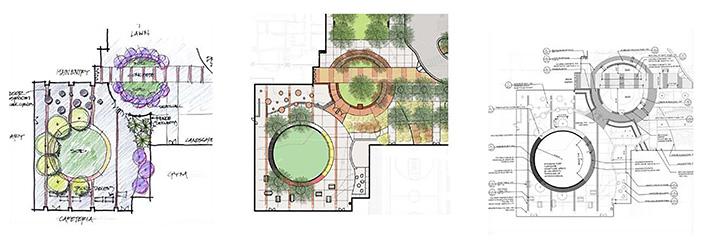
(Renderings developed by Craig Stoffel while working at DHM Design, prior to joining Ayres.)
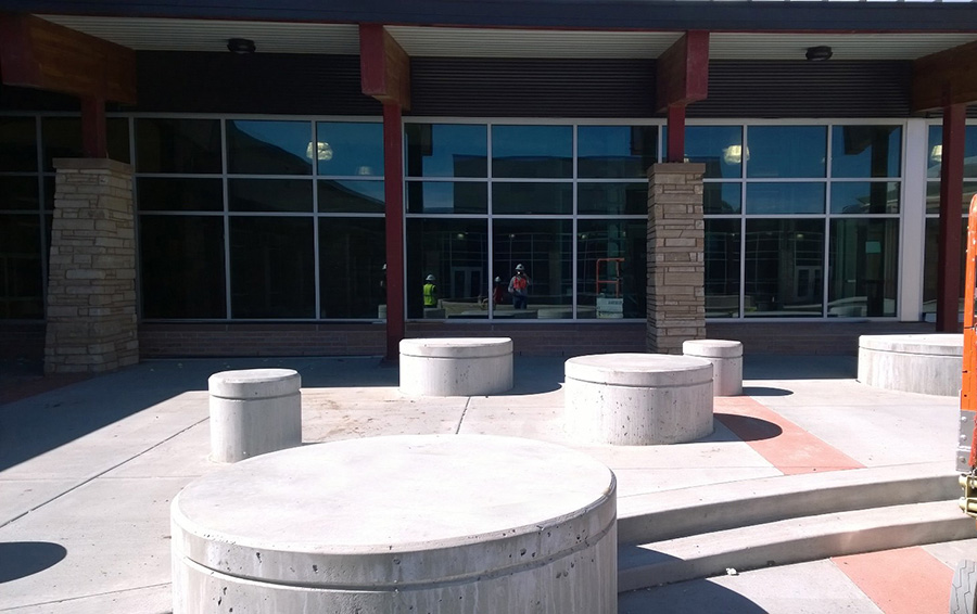
(Not an Ayres project)
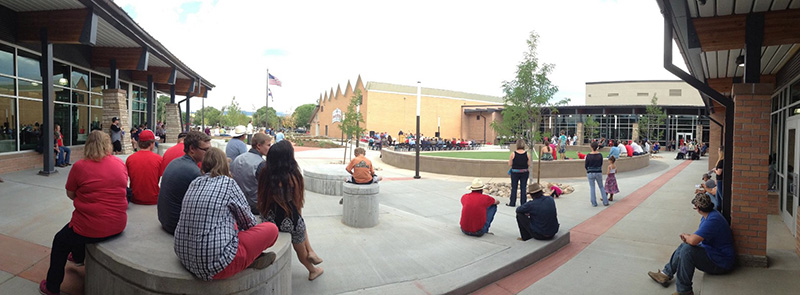
(Not an Ayres project)
The Deliberative Graphic Communication Approach
I encountered this deliberate graphic communication approach on a project for a university campus building addition and plaza space. The University Design Review Board was notoriously difficult to navigate. The design team had built SketchUp and Revit models of the addition and digitally rendered site plans. But in the 11th hour, they asked me to instead create loose axon sketches in ink, without color or refined materials.
They were concerned the graphics would communicate they had skipped the vital collaborative phase. So instead, I created simple textured sketches with enough detail to communicate the character and general organization of the space. The message needed to be conveyed that the design team was very much in the early concept design phase. Happily, the designs were well-received, and the team was given the green light to proceed into the next phase of design, paving the way for more refined, photo-realistic renderings to showcase the completed designs.
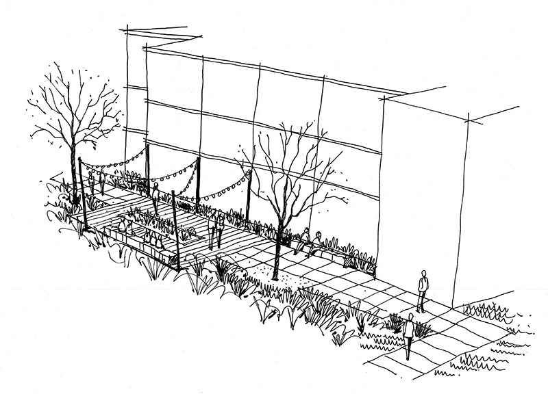
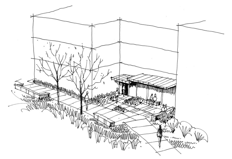
I have no doubt the debate will forever continue as to which is better, hand- or computer-generated graphics. The best answer I’ve heard so far and the one I prescribe to and hope eventually wins the day is, “Both.” Each has its place in communicating designs for evoking excitement (funding), thoughtful analysis, exploration, composition, buy-in, and ultimately communicating the overall vision of the design team.
Visit our landscape architecture page for more about the services we offer.

 By
By
Post a comment: